
Prosper Brand Refresh
Unifying and modernizing Prosper’s brand to align with the strategic product vision, driving customer preference for, and loyalty to the Prosper ecosystem.
Lead Designer · 2024-2025

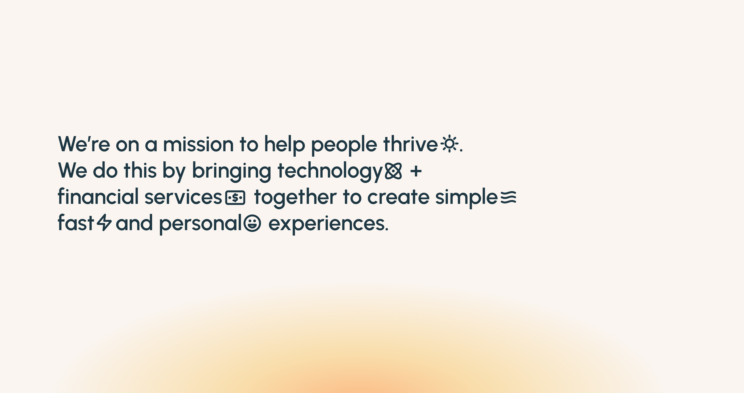
As Prosper’s strategy had evolved, so should its brand.
Our fast-growing fintech product portfolio was testing the resilience of the Prosper brand. Prosper had rapidly transitioned from a monoline lender to a full-service loan provider, offering multiple products in various lending categories.

Challenge: modernize & unify a 20-year-old brand to align with strategic product vision
The opportunity in front of us was to ensure the brand strategies (promise, positioning, value propositions, etc) and tools (architecture, nomenclature, visual and verbal guides, etc) to ensure the Prosper brand remains a driver of growth and not an impediment to it.
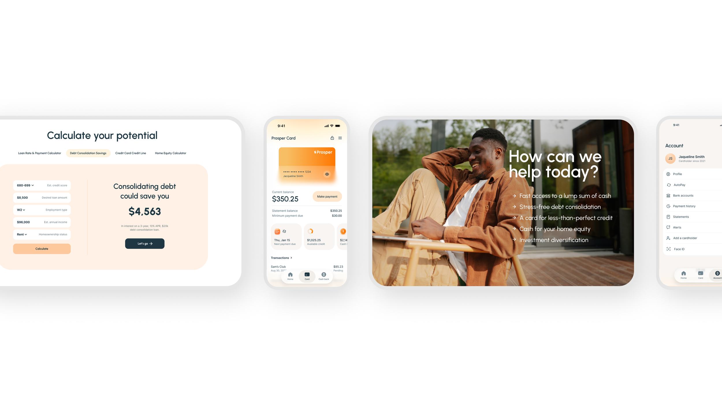
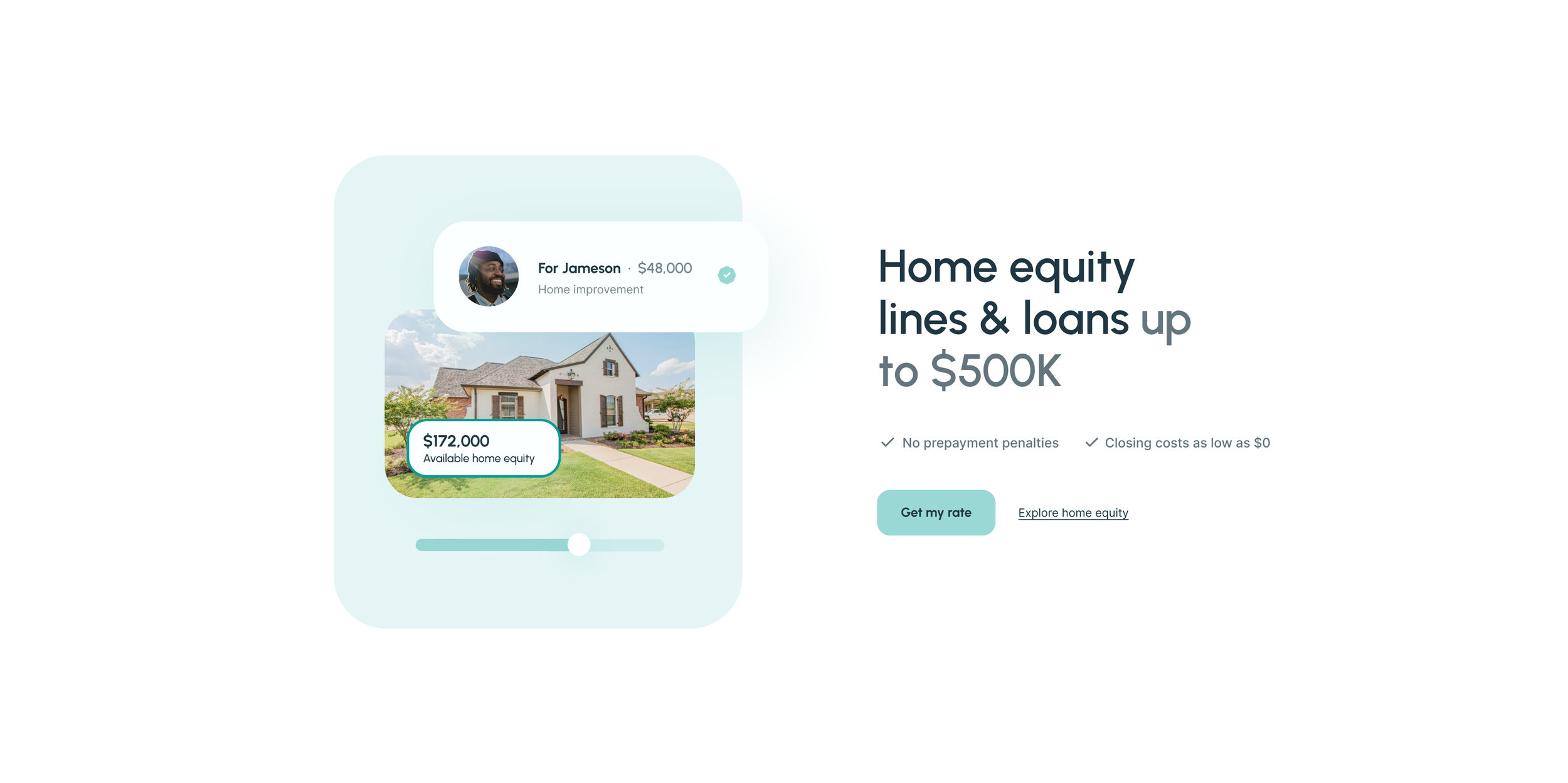
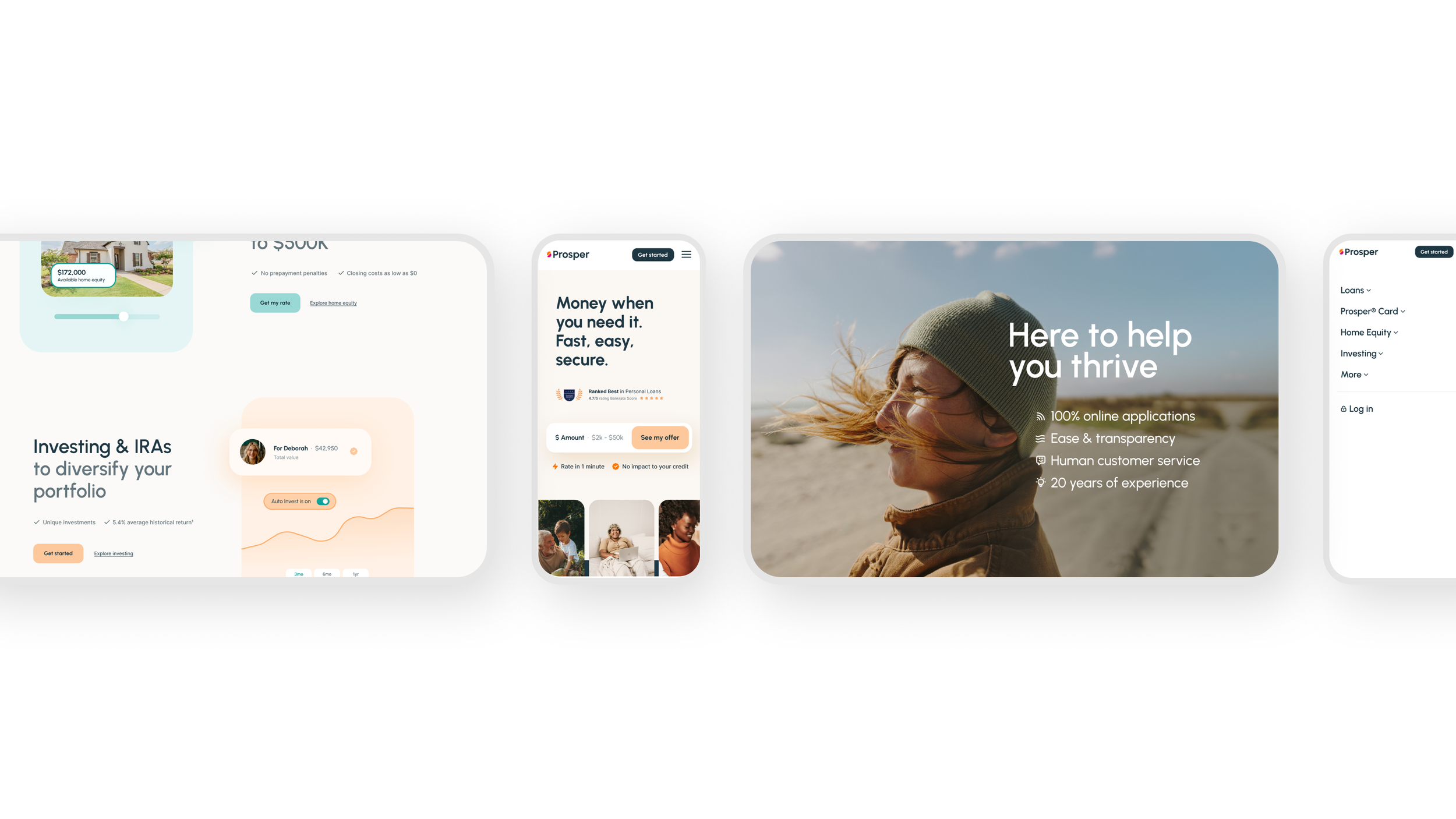
Old brand UX samples
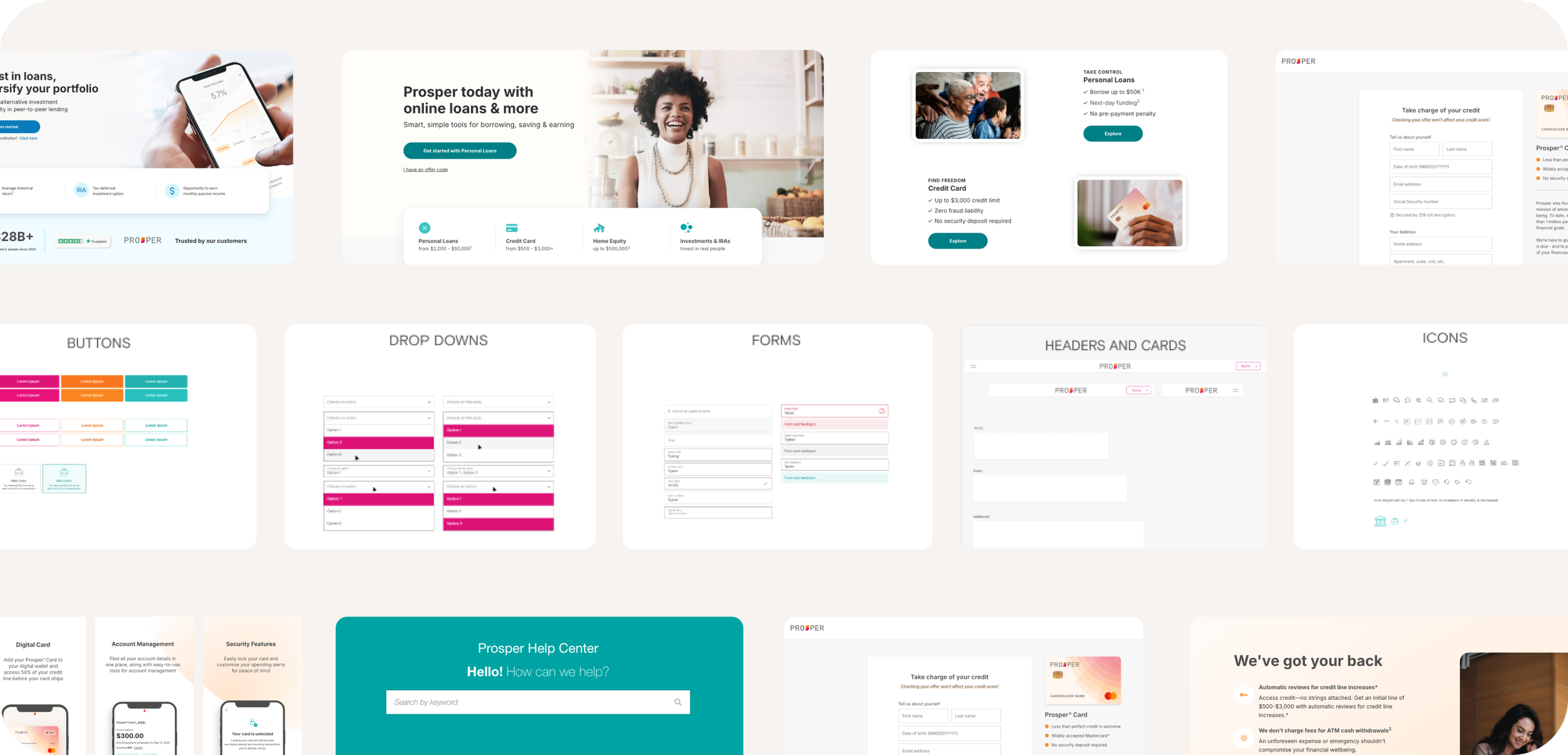
Approach: cast the vision → layout the roadmap → unify the product UX
A 20-year-old brand that spans product, marketing and identity doesn't get modernized all at once; it had to be a sequence of strategic decisions and Prosper C-suite level alignment.
The work began by establishing a clear creative vision for where the brand needed to go: defining the positioning, the visual language, and the story the brand needed to tell before a single pixel was changed. Foundational research included focus groups, surveying and quick-read visual preference testing. Additional research included cardsorting, tree testing, usability testing for select UX.
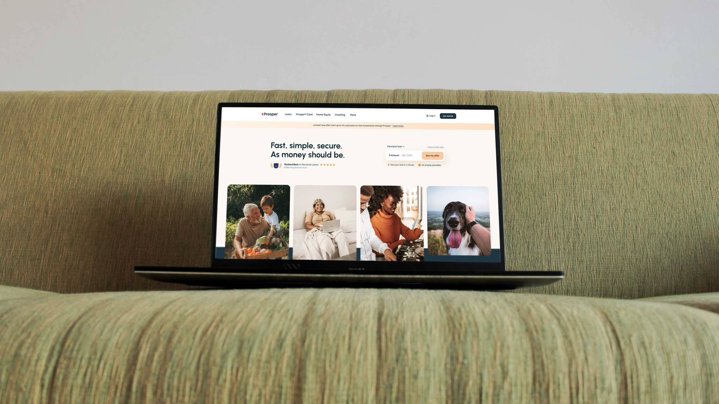
From there, a phased roadmap gave the work structure: sequencing identity, marketing, and product UI in a way that built momentum across teams. The final phase brought it all together, translating the new brand into a unified product experience that felt coherent whether a customer encountered it on prosper.com or the Prosper app.
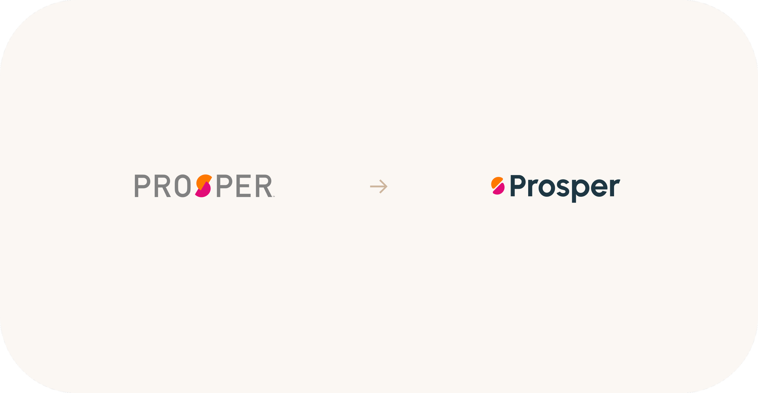
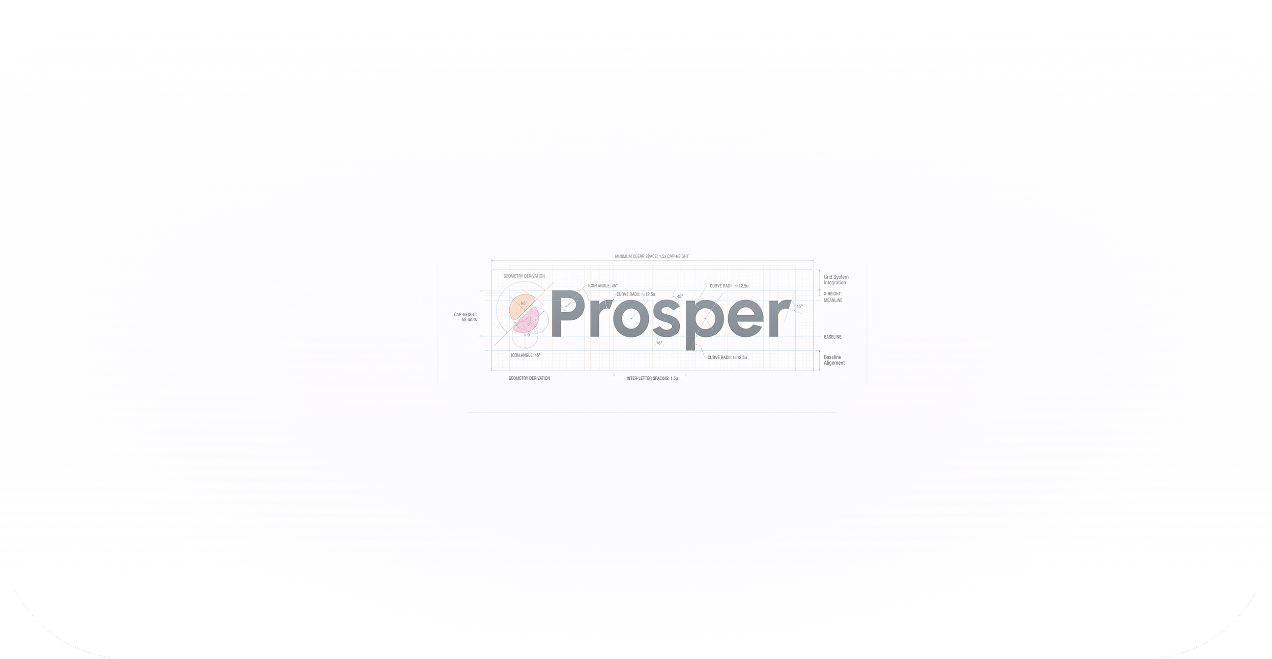
Logo
Color contrast: low, muted → high, vibrant
Casing: rigid → approachable
Inaccessible, mobile-illegible → accessible, mobile-legible
Traditional fintech vibe → modern digital platform
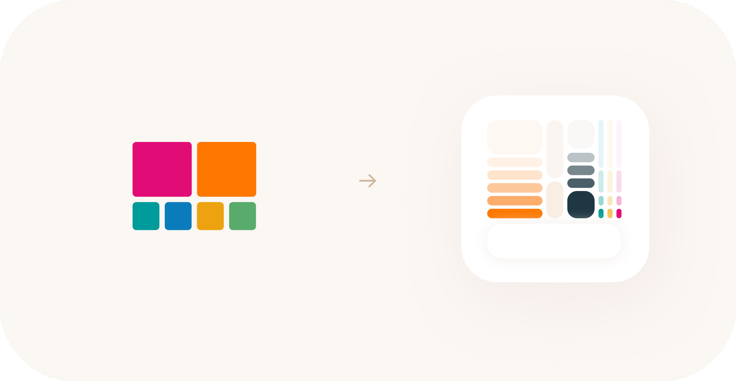
Color palette
Chromatic → tonal
Unprofessional → trustworthy
Static → dimensional
Disorganized → systematic
Design system
Rigid → adaptable/scalable
‘Look at me’ → ‘use me’
Diluted → semantically consistent
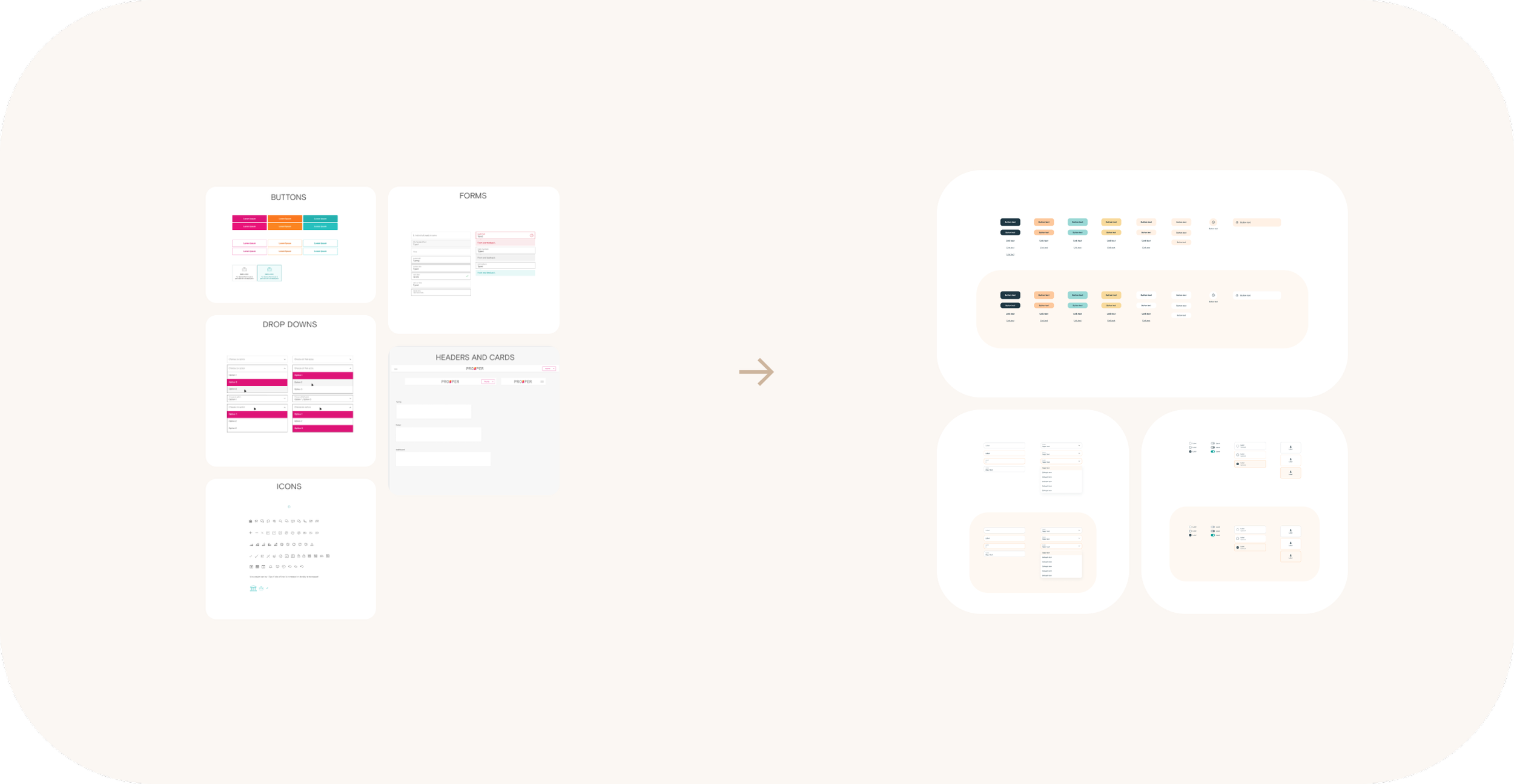
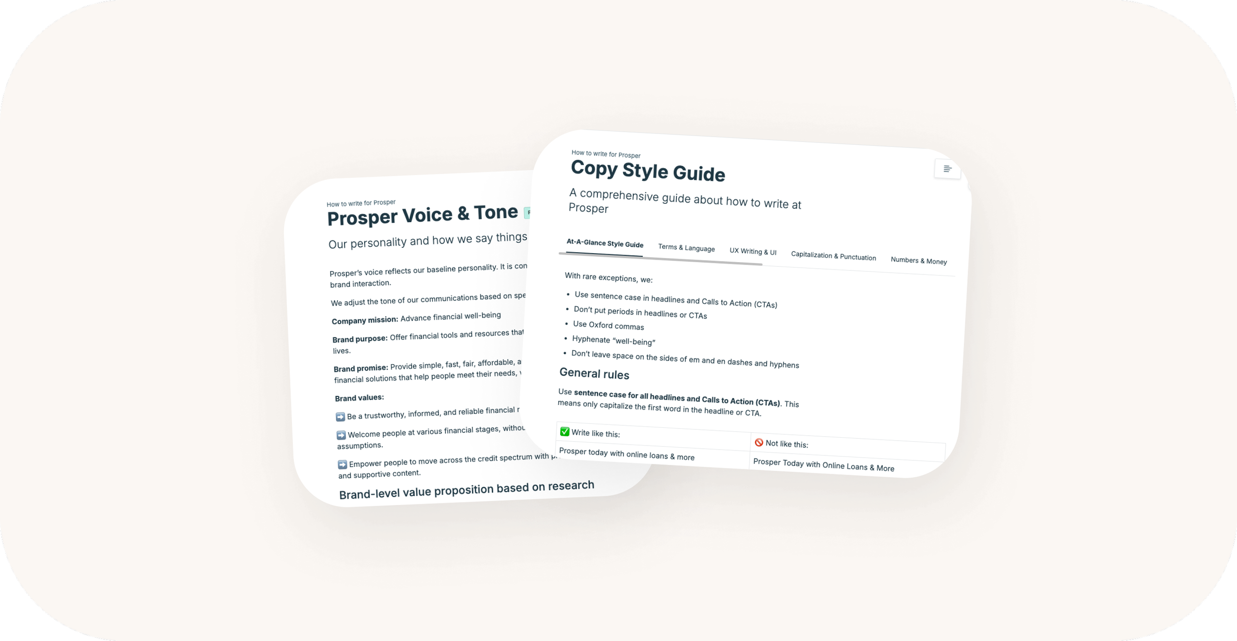
Content, AI writing and voice/tone guidelines
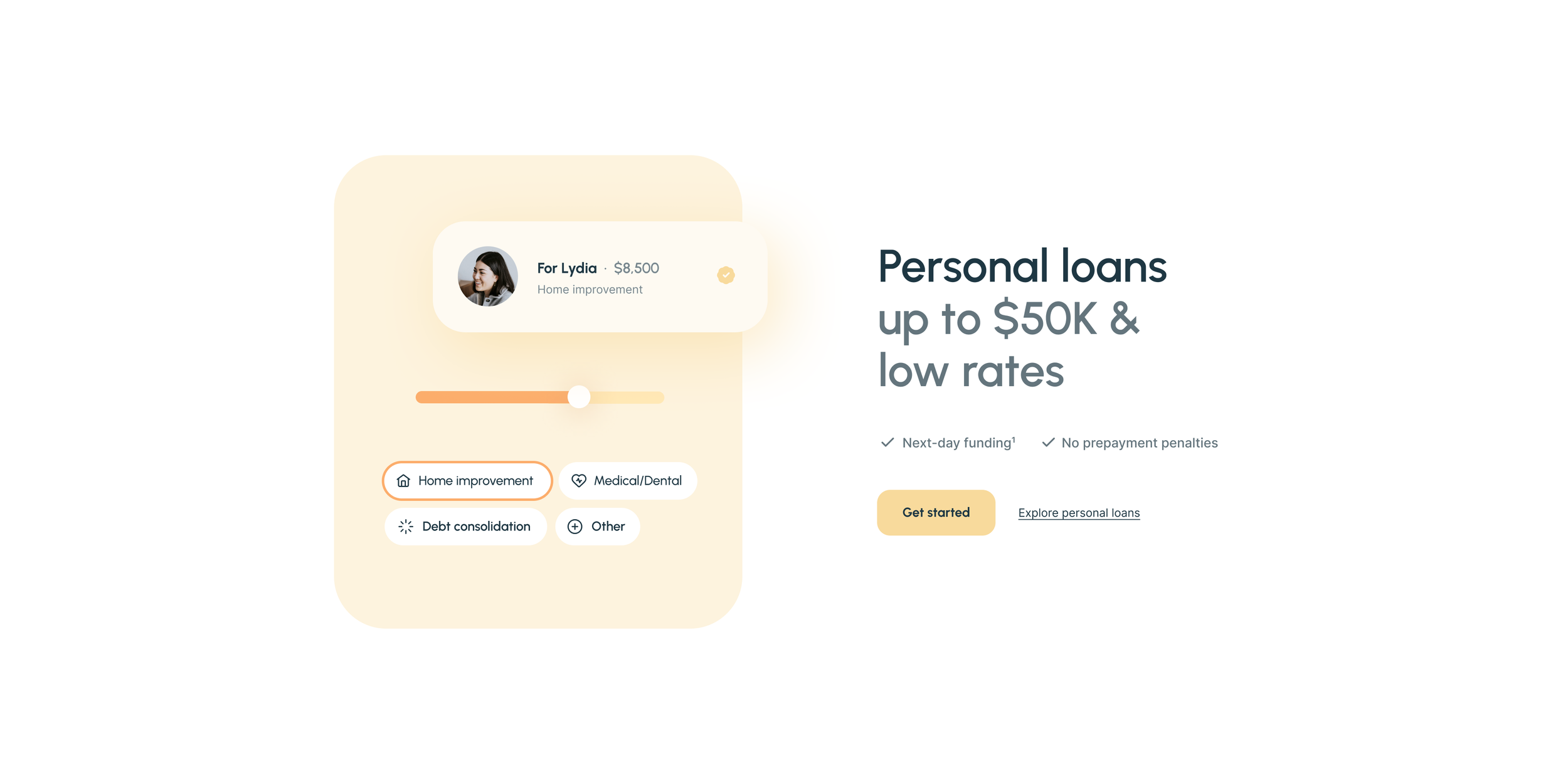
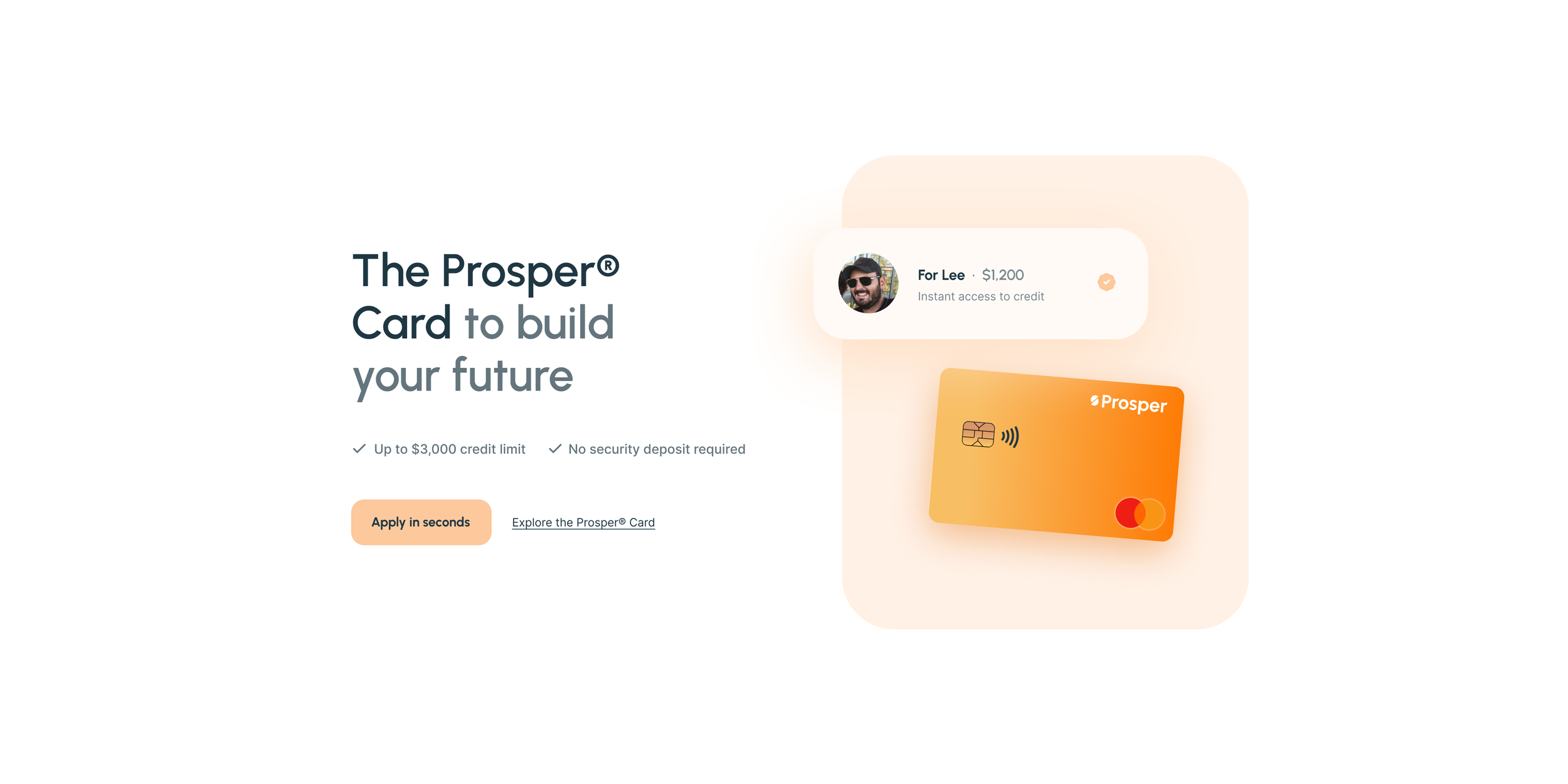
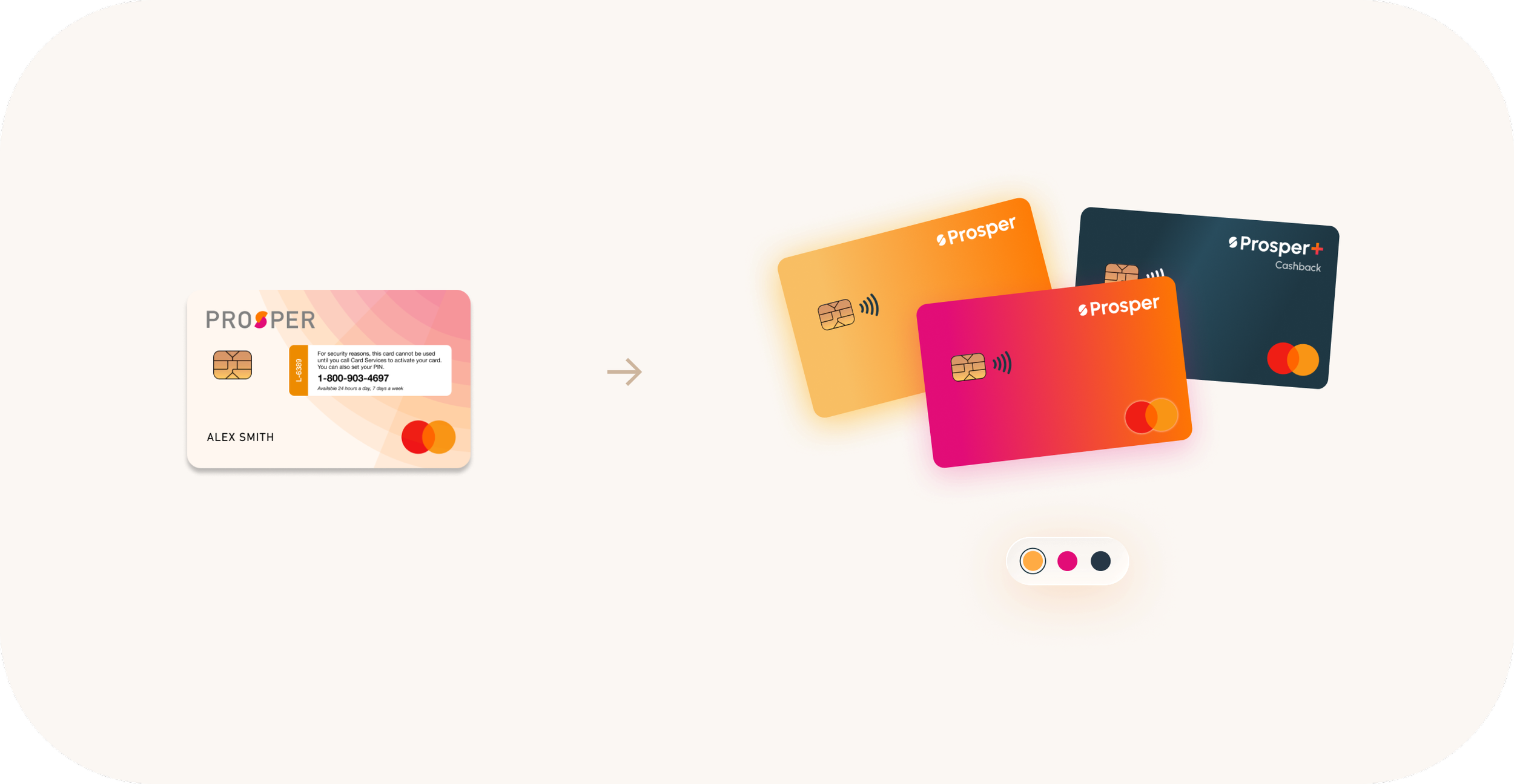
Cards ecosystem & vision
In tandem with brand decisions, UX drove:
Card personalization options
Vision-setting for the card product ecosystem
Long- and medium-term product roadmap decisions
Mobile app positioning
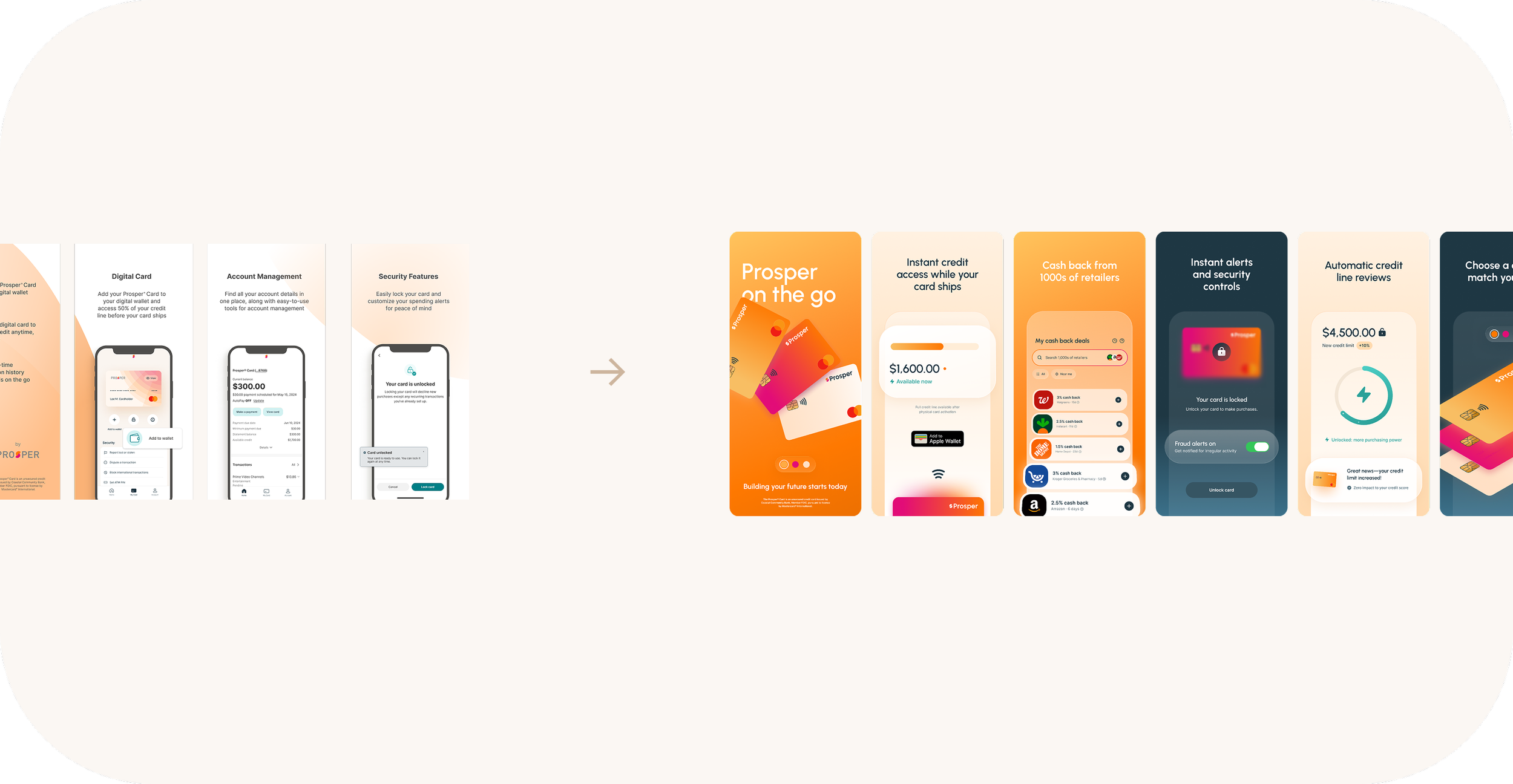
Fragmented → grounded → unified
Impact: end-to-end brand consistency across product experiences, fueling portfolio growth
While defining and measuring success of brand refresh efforts is a long-term investment and impact to brand equity will be ongoing, early signals are positive:
NPS:
Cost per acquisition: -$X X months post-brand refresh
Redesigned marketing site conversion:
+240bps/+34bps in app-submit rates for loan/card products
~+1.95MM in originations and ~+300 card apps/mo
Media & press engagement: +~60% engagement rate across social
Internal alignment: with a design system established, product and UX strategy is enabled to scale